At-home medical devices (blood pressure cuffs, oximeters, and scales) offer a continuous, accessible, and cost-effective way to monitor health, empowering patients while giving clinicians earlier insights.
We worked closely with GPs and older patients to design a dashboard that highlighted trends over time, replacing a clutter of daily feeds from the devices with one clear view. We also explored a voice-led wellness check-in to capture mental and physical wellbeing.
The project helped define the client’s role in the healthcare ecosystem and informed their future product strategy.
MY ROLE
Senior Product Designer / UX Researcher
PROCESS
User Research, Userflow Mapping, Wire framing, Prototyping, User Testing, Visual Design
Client
HealthConnect
THE CHALLENGE
Data Overload
The client, a data-layer provider, wanted to test whether they should play a more visible role in how at home devices data reached doctors.
Doctors were overwhelmed with device reports arriving as separate PDFs, each with inconsistent formatting and no clear way to track trends over time. Important insights were buried in volume and noise, requiring manual effort to extract meaningful changes in a patient’s condition.
The clinic we collaborated with—modern, busy, and forward-thinking—highlighted how inefficient this process was. What they needed was a quick, at-a-glance overview that could help them spot red flags without digging through dozens of documents.
Meanwhile, patients had no way of seeing their own health data, and family members supporting their care were left in the dark.
THE RESEARCH
The Approach
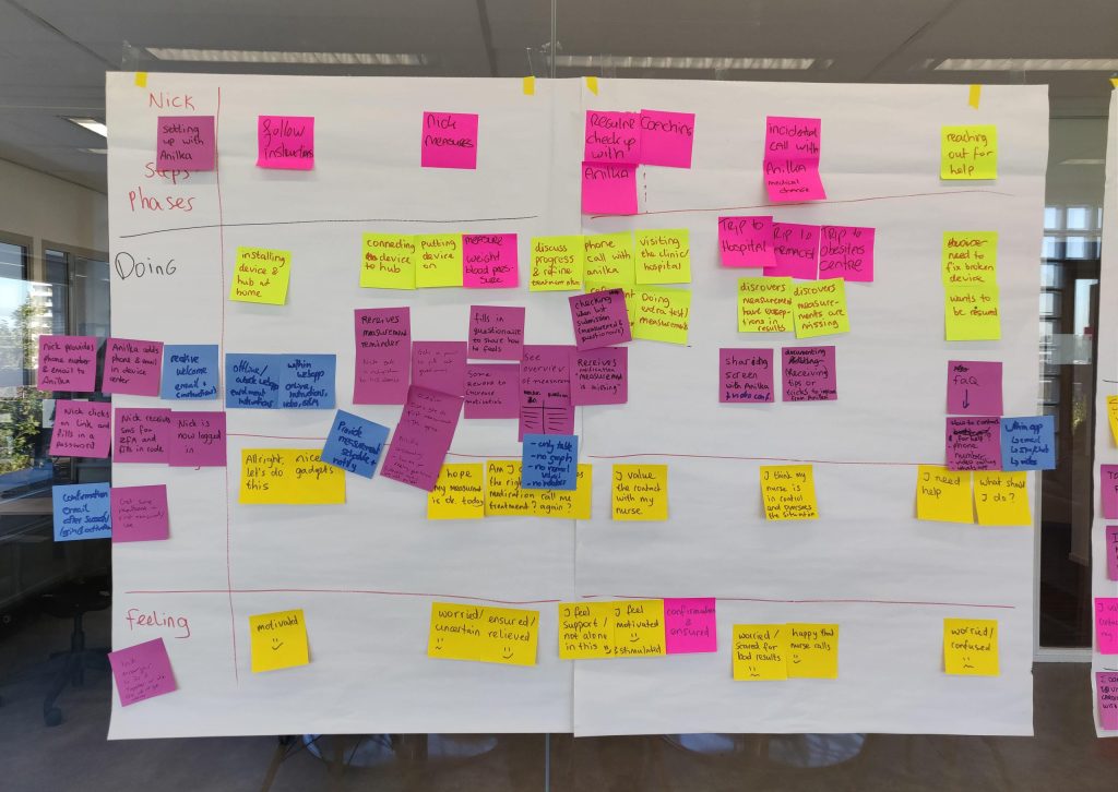
We kicked off by speaking directly with doctors to understand the daily friction they faced reviewing patient data from at-home devices.
In discovery interviews, one recurring issue stood out: fragmented, unreadable PDFs arriving in bulk. We mapped out the data flow between devices, middleware, and clinical systems to uncover key inefficiencies. From there, we focused on how we might streamline insights, surface trends, and reduce mental load — all without adding more admin work to the doctor’s day.
This user-led approach helped shape our core design hypothesis: doctors don’t need more data, they need better visibility into what’s changing over time.
THE RESEARCH
The Research Insights
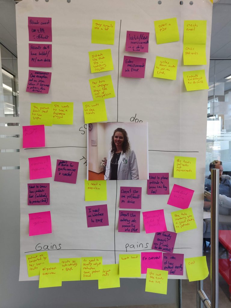
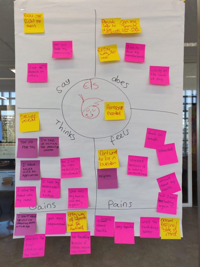
To ensure our solution was genuinely user-centered, we conducted empathy mapping workshops with key stakeholders clinicians and older equipment users.
Clinician Perspective: Empathy mapping revealed doctors’ main frustrations around fragmented reporting, labor-intensive data review, and lack of meaningful patient trends in existing systems. Quotes like “Don’t like navigating old reports or messy EMR” and “Need to place reminders, too easy to miss things” guided us to design clear visual overviews and trend graphs. This approach supports clinicians in tracking progress efficiently, reducing manual effort, and improving patient follow-up.
Equipment User Perspective: Mapping sessions with older adults using remote monitoring equipment highlighted feelings of isolation and dependency (“Can only depend on others”, “No knowledge about my condition or what results mean”). Many voiced a desire for more accessible health information and the ability to take ownership of their wellbeing. These insights led us to create simple dashboards, transparent motivational feedback, and personalized views, helping users feel empowered about their health journey.
Translating Insights Into Design: The empathy maps were not just exercises, they directly informed our design process.
For clinicians, we prioritized features that addressed their workflow pains. For patients, our dashboard is optimized for clarity, encouragement, and independence. By grounding our solution in real user needs, we’ve built a HealthConnect experience that solves meaningful problems for everyone involved.
ABOUT THE BUILD
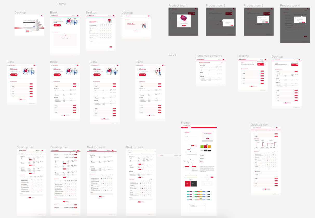
Prototyping the Solution
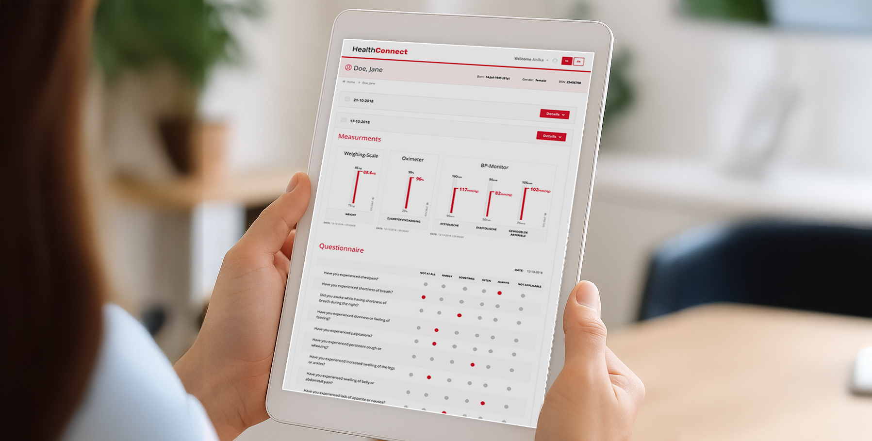
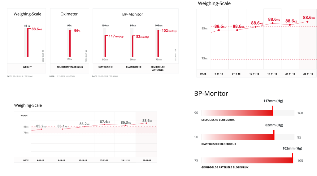
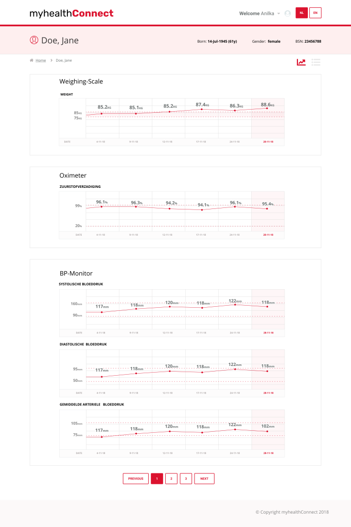
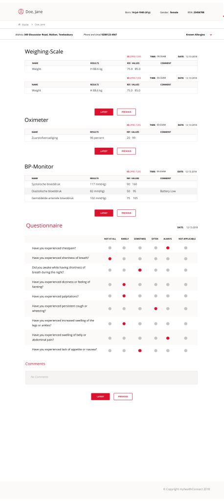
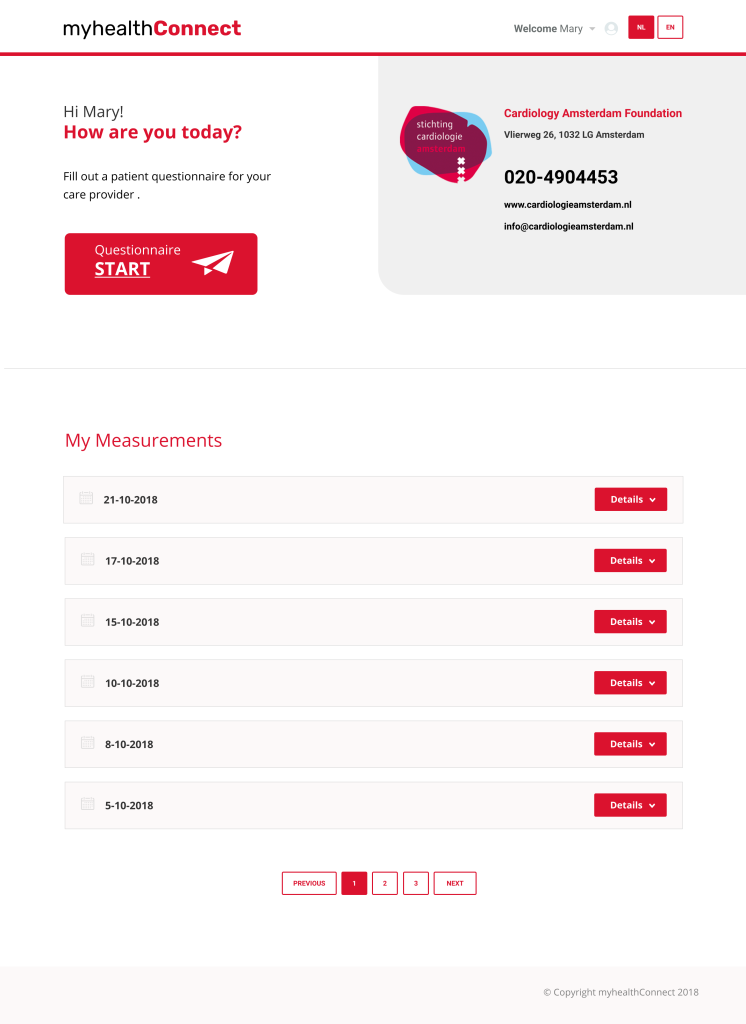
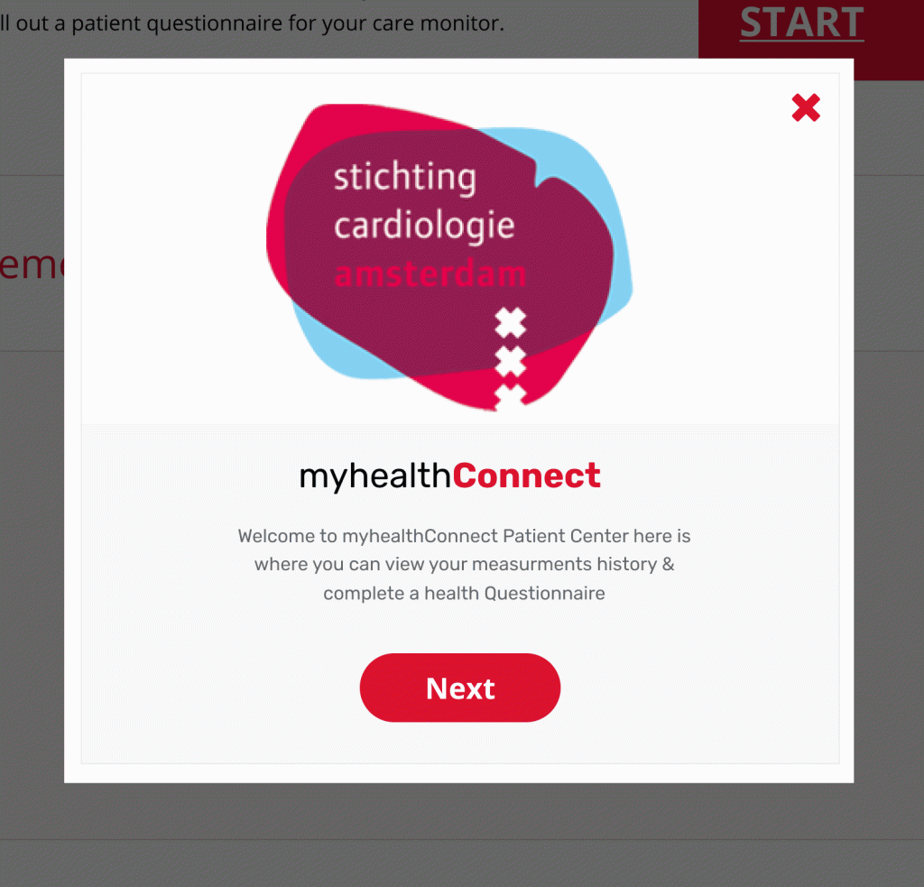
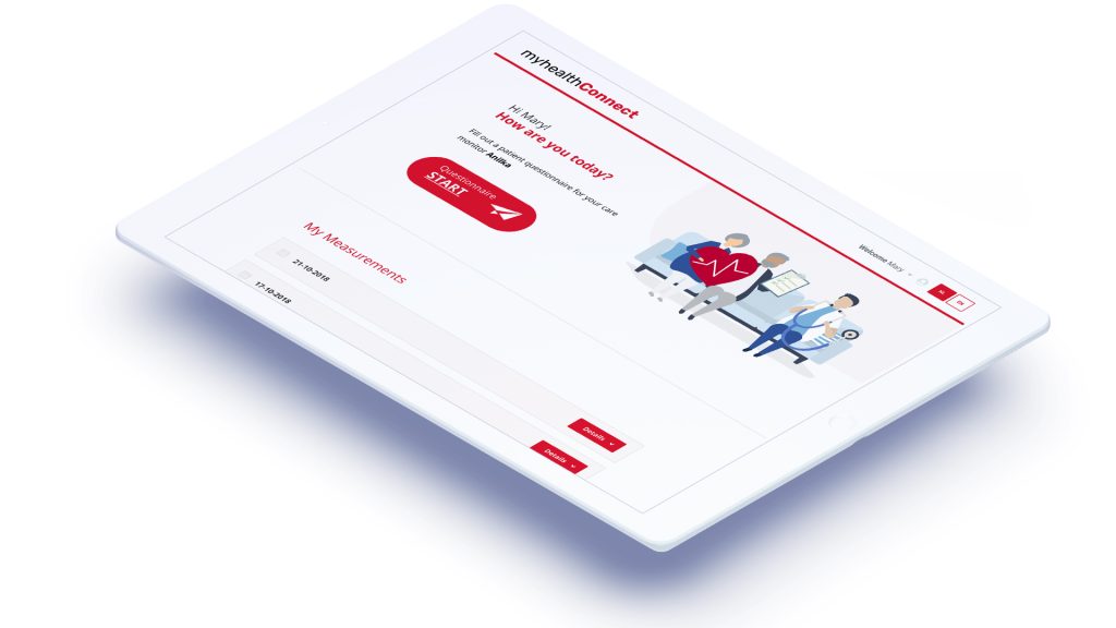
With clear insights from research, we built a proof-of-concept dashboard that made key patient data easy to scan and understand at a glance.
Instead of sifting through scattered reports, doctors could now view trend lines for each patient — visualised over time and colour-coded for quick recognition. The design allowed them to spot concerning changes early, while giving them a calm sense of oversight when everything was stable.
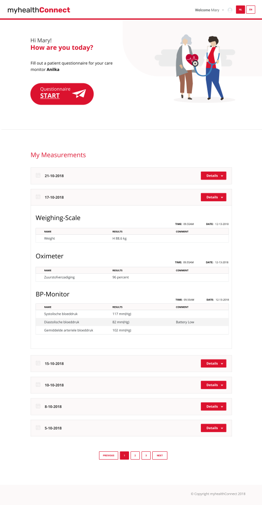
We also explored an early-stage wellness check concept, led by voice. This would allow elderly patients to respond to simple daily prompts like “How are you feeling today?” without needing a tablet or screen. The responses could then be summarised and sent to the doctor alongside the device data.
ABOUT THE BUILD
Informational Clarity
The visual design focused on creating a calm, uncluttered interface that reflected the seriousness of the medical setting while being approachable and intuitive.
Each patient had their own overview panel, and all key health indicators were shown in a single view, eliminating the need to open multiple files or dashboards.
Typography and spacing were carefully chosen to support legibility under pressure, and we built both doctor and patient views to ensure transparency on both ends.
While the doctor interface provided trend summaries and alerts, the patient view allowed individuals to see their own data in a simplified format a first-time experience for many of them.
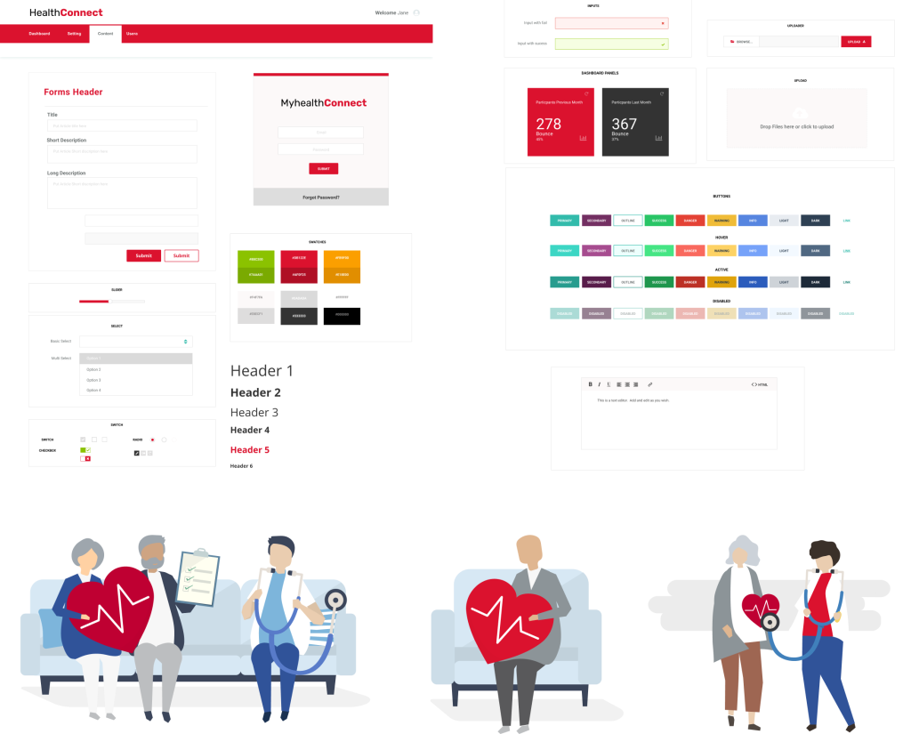
ABOUT THE DESIGN
Visual Design
Most carers work alone and we strongly felt that the new brand to have a warm and friendly feel.
This intention guided our selection of color schemes, typography, and visual elements, aiming to create an inviting and approachable atmosphere for users.
We focused on incorporating light, bright colors and clean lines to convey freshness and modernity, while ensuring the design remained user-friendly and easy to navigate.
Takeaways
The pilot showed how valuable clean, well-presented data could be for overburdened doctors. The time-based trend graphs made it easy to spot issues at a glance.
While the feedback from clinicians was overwhelmingly positive: “This is incredibly helpful. I can finally see what’s going on over time.”
The project also revealed a strategic crossroad for the client. Rather than introduce a separate tool, the client chose to pursue integration within existing doctor-facing systems such as Electronic Health Records (EHRs), ensuring their solution aligned with the daily workflows of modern clinics.”
For me, it was a powerful reminder of how design can create clarity in complex environments, and how listening closely to users especially in healthcare can guide both product and business decisions.